
How to Read a Live Solar System Map Without Confusing Scale
Explore a live solar system map with clear distance references, time controls and scale limits. Connect planet positions with your local observing opportunities.
A solar-system map can make planetary motion feel understandable in a way a list of distances cannot. It also has to solve a difficult display problem: the planets are tiny compared with the space between their orbits. A useful scene usually enlarges bodies or compresses distances so you can see something on an ordinary screen. Open Solar System Live with that educational purpose in mind.
The illustration and the numerical fields play different roles. The scene helps you recognise relationships and motion; the labelled values provide the actual units and reference context. NASA's solar-system overview is a useful source for the worlds themselves. A public interactive map should not be treated as a true-scale photograph of their current arrangement.
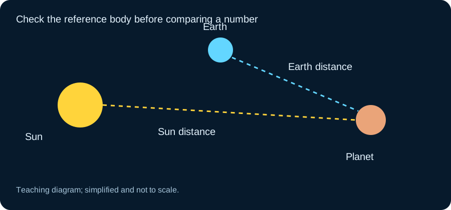
Find the reference point before reading distance A distance can be measured from Earth, the Sun or another body. Those values describe different separations and can change differently over time. A planet relatively stable in its distance from the Sun can still vary substantially in its distance from Earth as both travel around their orbits. Read the label beside the number before comparing two panels.
Use Distance from Earth and Distance from Sun as separate questions. If the map visually places an object near Earth, check the numerical distance rather than estimating with a ruler. Perspective, zoom and display scaling all affect apparent separation. The scene can remain educational while using a readable scale that is deliberately different from physical reality.
Understand a top-down view and a tilted view A view near the planetary orbital plane can make several bodies appear aligned even when they are widely separated in depth. A top-down view reveals another part of the arrangement but may make vertical differences harder to notice. Changing the camera angle changes the presentation; it does not move the planets themselves.
Try using a stable viewpoint while comparing dates, then rotate separately to explore the three-dimensional arrangement. If you change both date and camera angle at once, it becomes harder to tell which visual change came from motion. A modest, repeatable comparison teaches more than rapid spinning and zooming without knowing which object or time is selected.
Distinguish the displayed time from real time A live mode follows the present, while a timeline or accelerated animation can explore other moments. Check the time label whenever you move a speed control. A fast-moving planet in a time-lapse does not mean its actual orbital velocity suddenly increased. The interface is showing more simulated time per second of viewing.
Return to the current-time setting before using the result for tonight's sky. If a tool provides a future date, treat it as a calculation for that selected moment. Keep the time and object in the same note when you save a value. An attractive screenshot with no time context is not enough to reproduce the arrangement later.
Orbital position is not local visibility A heliocentric map shows where worlds lie around the Sun. It does not automatically tell you which ones are above your horizon. For that, the observing location and Earth orientation must be included. Use Planet Positions Today for the relevant context and Planets Visible Tonight for a local observing plan.
This distinction explains a familiar surprise: a planet can be easy to find on a solar-system diagram and impossible to see from your location at the chosen time. It may be below the horizon or too close to the Sun's direction for comfortable observation. The map is still useful; it is answering a different question from the local sky tool.
Target, centre, time and units define what an ephemeris result means, even when the surrounding scene is visually simplified. Read JPL’s Horizons documentation when you want to check the underlying context rather than infer it from a thumbnail or summary number. Compare it with the solar system tool for the selected question.
Apparent alignments do not imply close encounters When several planets appear along a band in the sky, they can be separated by very large physical distances. The observing perspective creates the pattern. A solar-system map helps illustrate this by placing the planets along different orbits instead of drawing them as neighbours on a flat sky chart.
Use Planetary Events Calendar for event context, then compare the local view with the larger arrangement. Avoid language suggesting that a sky alignment means the worlds are about to collide or that the scene predicts an exceptional effect on Earth. The ordinary geometry is interesting enough when explained accurately.
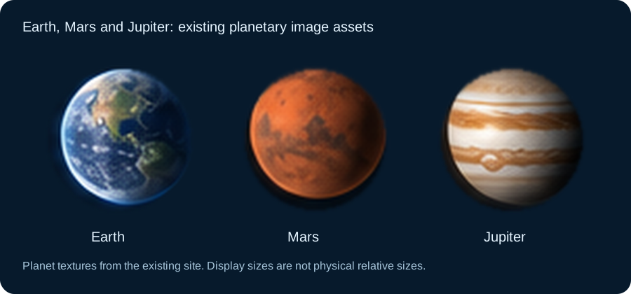
Planet textures are illustrations of surfaces A recognizable Earth, Mars or Jupiter texture helps identify a body. It is not necessarily a continuously updated image of the planet at the current moment. Some textures combine observations or represent a particular global map. Read the caption or source information when interpreting detailed surface or cloud features.
Likewise, enlarged rings, moons or spacecraft make small objects easier to select but can distort the physical proportions. Solar System Planets provides a better place to compare basic properties. Keep those properties separate from the convenience of the display: the largest clickable object on screen is not necessarily the largest world in the physical system.
Try a simple Earth-Mars distance exercise Keep the reference and units fixed, then compare Earth-Mars distance at two suitably separated dates using the tool's planning controls if available. Notice how both worlds move. Their separation is not determined by subtracting two fixed orbital radii, because the angle between them changes as well.
Then look at the corresponding local observing context. A closer world is not automatically high in your sky at a convenient time. NASA's Mars information supplies the planetary background, while the map supplies spatial context. This exercise connects numerical distances with a moving system without pretending a compressed animation is a measurement instrument.
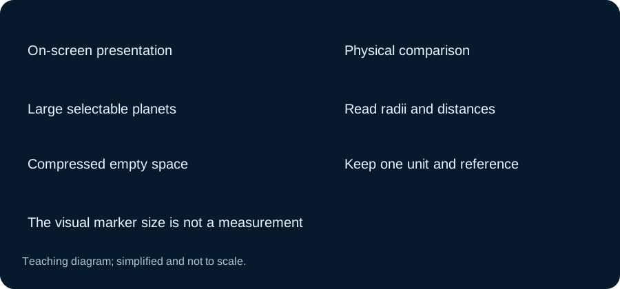
Why scale can change your first impression If the scene used physical planet sizes and orbital distances on one ordinary screen, many bodies would be too small to select. Enlarging them is a reasonable presentation choice as long as the page explains it. The same applies to spacecraft markers and highlighted orbit lines. Their visibility on screen should not be interpreted as a measurement of physical diameter or the width of an orbital path.
Try comparing the listed planet radii or diameters separately from the map's appearance. Then compare the numerical distances in a consistent unit. You will appreciate how much empty space lies between the bodies and why a readable educational view needs compromises. Keeping those comparisons separate lets the scene do its job while the values carry scale. It also prevents a striking close-up from suggesting that two worlds are physically crowded together.
Leave with one relationship you understand A good session can be as simple as learning why Earth-relative distance changes or why an apparent alignment differs from a physical line in space. Select one object, keep the time clear and read its reference labels. Add a local sky check when the goal is observation rather than exploration.
For the calculation conventions behind ephemerides, consult JPL Horizons documentation and the tracking-engine guide. The interactive map is most valuable when it turns curiosity into a specific question, then helps you answer it with the right units, viewpoint and time.
Compare one frame and one time consistently
When comparing two ephemeris values, keep the target, reference body, time and units together. A change of centre can alter both distance and speed without implying that either calculation is wrong. The picture should support that comparison, not override the labels. If the interface does not expose a setting, state the limitation rather than assuming a convention from the apparent direction of an arrow.
Continue with the solar system tool for the selected question, and keep JPL’s Horizons documentation beside the result when you need its definitions or broader context.