
Make a star map for a place and a moment
A useful personalized star map begins with an actual sky calculation. A title can make the result meaningful, but it should not turn a random collection of dots into a supposed view of an anniversary or a journey. This tool projects real catalogue stars above the horizon for your saved observing location and selected UTC time. Add a personal title, choose the style and export the chart as a PNG. For an initial orientation, compare it with our night sky tonight page before making a map for another date.
The map is a calculated reference rather than a photograph. It includes a bright-star subset, selected named guide stars, schematic constellation lines and positions of the Moon and several planets. Its purpose is to preserve the broad arrangement of the sky, not to reproduce every faint source or every detail of an instrument's field.
Get the time reference right first
The main field is explicitly UTC. If you are remembering a local event, convert its local time to UTC before entering it. A date without a time is not enough to specify a local sky, because Earth's rotation changes which stars are above the horizon over the course of the night. Midnight in one country also corresponds to a different UTC calendar date in another.
Your observing place comes from the shared site header. Check the coordinates if you are using the map for a journey or an event away from home. The title can mention a different city, but it does not change the calculation. This deliberate separation prevents a beautifully labelled map from silently using the wrong location. Use the displayed location and UTC timestamp as your final check before downloading.
Reading the circular projection
The chart looks upward from the observer's location. The centre is the zenith directly overhead, and the outer circle is the mathematical horizon. Altitude circles help distinguish high targets from those near the edge. North is at the top and east is to the left, matching a sky-facing chart rather than a conventional ground map. The labels make that orientation explicit.
Distances across the projection are not a single uniform angular scale everywhere. The chart is designed to show the whole visible hemisphere in a compact circle. Use it for broad position and pattern recognition, not for measuring a close separation directly from screen pixels. For a telescope target, our deep sky object explorer provides catalogue information and local directions that complement the larger map.
Real stars and the limits of the subset
Most background points come from the site's 2,500-source bright ESA Gaia DR3 subset. Gaia's G-band magnitudes are not identical to a visual V-band brightness scale. The brightest named guide stars come from the existing site catalogue, whose older coordinates include rounded values. These sources provide real orientation rather than decorative randomness, while their limits remain visible in the chart description.
The tool is not an all-sky survey viewer. Fainter stars outside the subset are absent even when an instrument could detect them. Proper motion is not individually propagated for each star, so a map far from the catalogue era is approximate. The date transform handles changing coordinate orientation, but it should not be interpreted as a precision astrometric solution for every historical star position.
Choose a brightness limit thoughtfully
The brightness control changes which catalogue stars are drawn. A brighter limit can simplify the chart and emphasize familiar patterns. A fainter limit adds more points, although the finite catalogue remains the limit of what the tool can display. Dot size is a visual aid related to brightness, not a scale drawing of stellar disks.
This control does not predict the actual limiting magnitude at your observing site. Urban lighting, Moonlight, haze, eyesight and dark adaptation all affect which stars you can see. A dark-looking chart can still describe a daytime sky if that is the time you selected. Read the timestamp and Sun position together. For practical observing conditions, check a current forecast and the real sky rather than treating a display setting as a measured environmental condition.
Constellation lines are guide patterns
The optional lines connect selected named stars into recognizable shapes. They are schematic guides, not official constellation boundaries and not a complete set of every traditional pattern. Turning them off can produce a cleaner keepsake; leaving them on can help someone learn to move between familiar stars. Either choice uses the same underlying positions.
A line may vanish near the horizon because one of its guide stars is below the visible hemisphere. That is preferable to drawing a complete pattern through the ground. Some patterns also extend beyond the named stars included here, so a sparse line drawing should not be read as the entire constellation. Our visible constellations guide offers additional context when you want to turn the personalized picture into a practical learning exercise.
Moon and planets add a time-specific detail
The Moon and supported planets are calculated for the chosen observer and time. They help distinguish one dated chart from another with a similar background of stars. The markers indicate position; they are not scale images of planetary globes or a detailed rendering of the Moon's phase. A label close to the Sun does not imply that the object is safe or easy to observe in daylight.
For a more detailed lunar plan, use Moon phase tonight alongside your map. For a telescope view of a planetary system, use the dedicated moon trackers. Those pages answer questions that a whole-sky keepsake cannot: a chart can show where Jupiter is, while a moon tracker can show the arrangement of its companions around the globe at the same observing time.
Drag, zoom and reset before exporting
You can move the chart with a mouse or finger and use a wheel to zoom. These controls help inspect crowded labels and high-altitude patterns. The Whole sky button restores the default framing. Before creating a keepsake, reset the view unless you specifically want a cropped or shifted chart; the PNG captures the chart's current framing.
The title field is drawn as plain text, with a length limit to keep it readable. Short, specific wording usually works better than a paragraph. The timestamp and location remain on the exported image so the map has a clear reference. Check label overlap at the chosen frame and brightness setting. A simpler chart often prints more legibly than one with every available point and guide line displayed.
NASA imagery belongs to the explanation
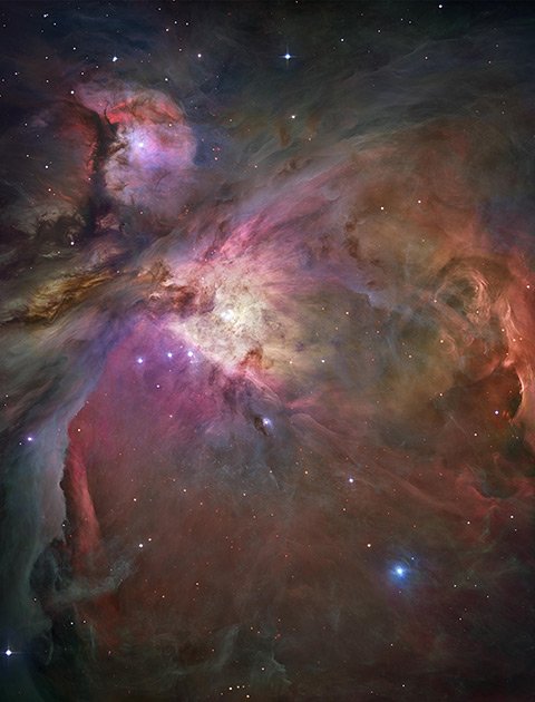
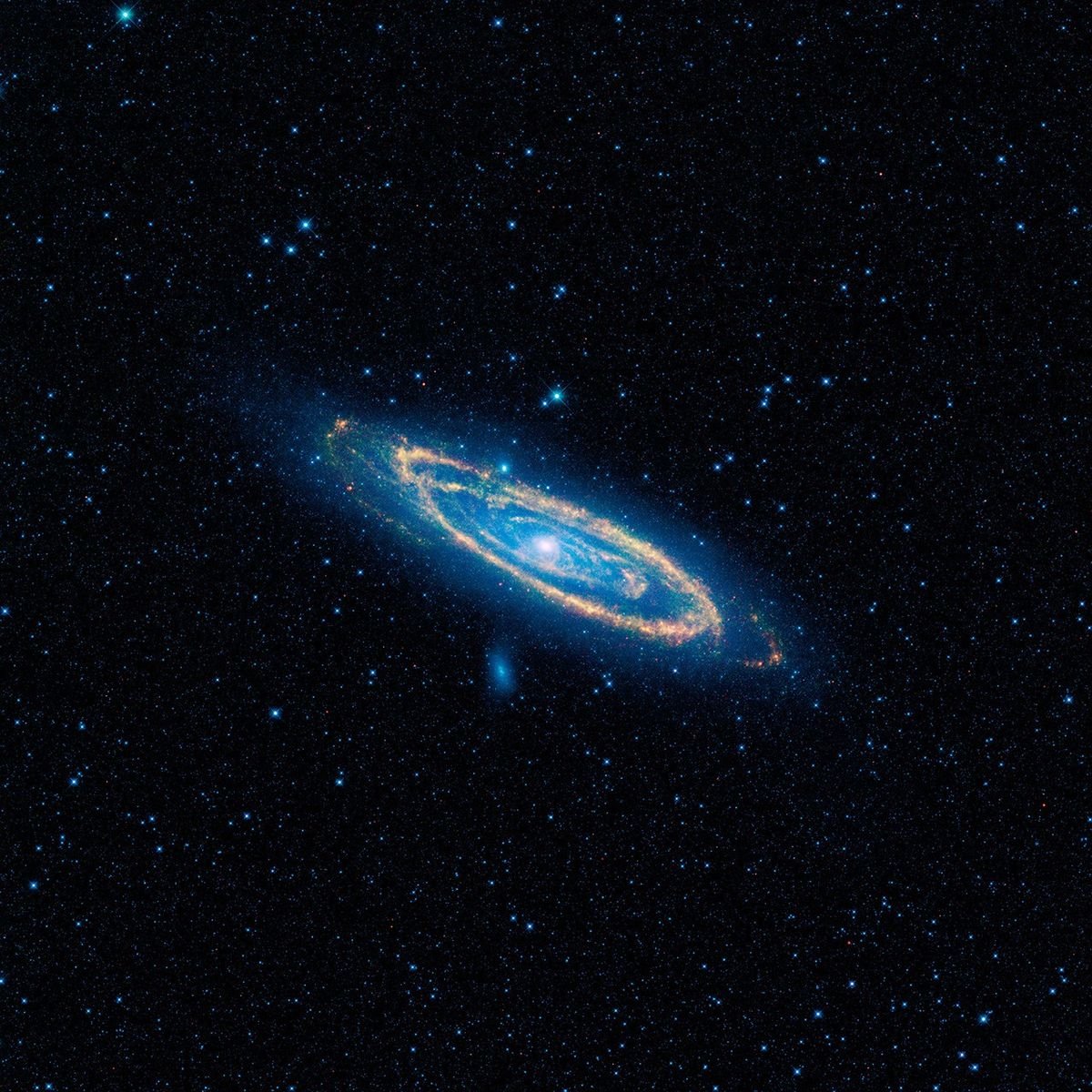
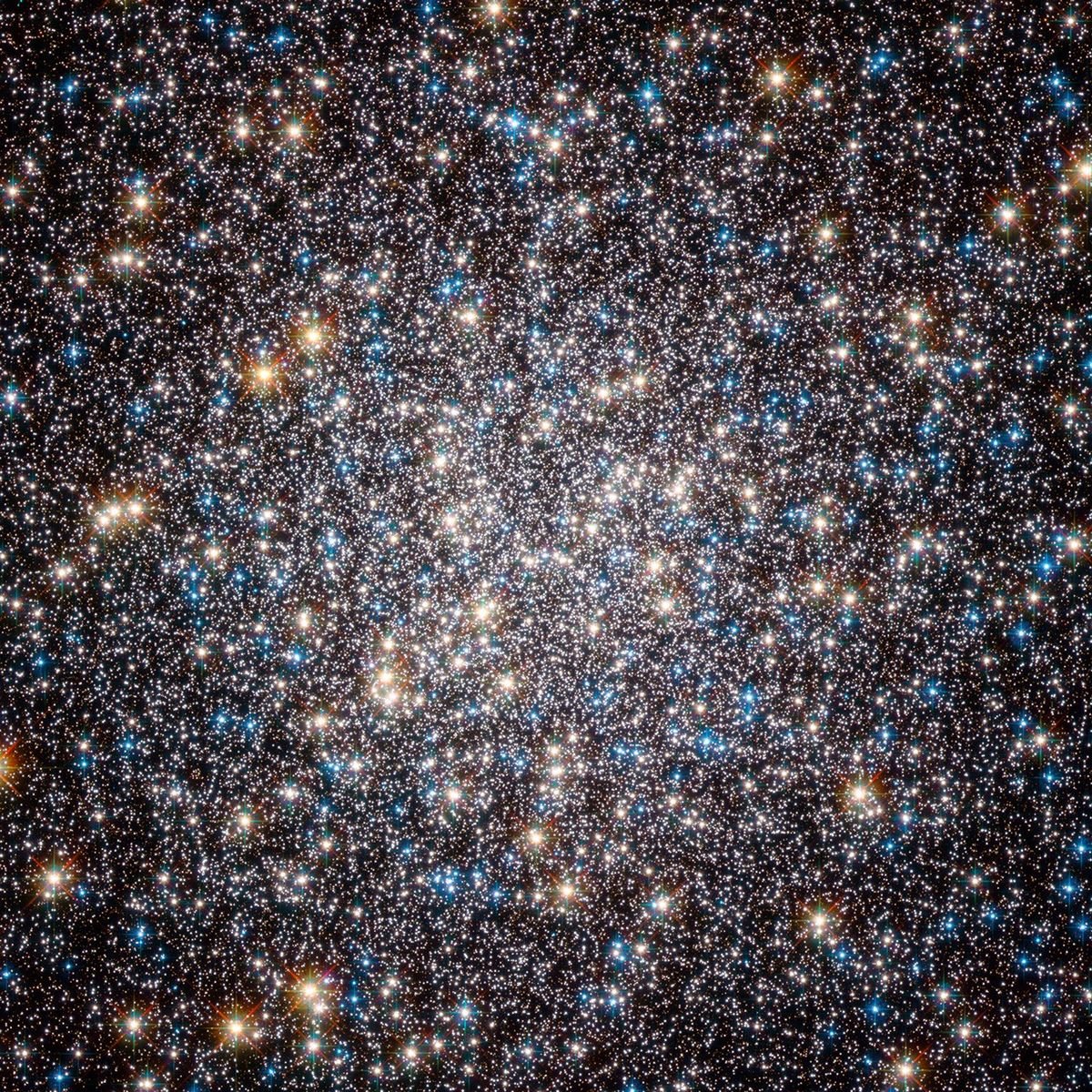
The three NASA reference photographs in this guide show the Orion Nebula, Andromeda and the globular cluster Messier 13. They connect familiar sky regions with the physical objects found there. They are not pasted into your exported chart as if they were naked-eye views, and they are not photographs of your selected date or location.
Each caption links to the original source and identifies the instrument context. The Andromeda image is an infrared WISE view, while the other references include Hubble observations. Those differences matter: wavelength and exposure can reveal structures and colors that a visual chart does not show. A real star map and a mission photograph are both useful when their roles are clear. The chart preserves direction and timing; the images teach you about the objects beyond the points.
A chart worth keeping and using
Download the PNG after checking the title, UTC time, coordinates and full-sky framing. The image is generated locally in your browser from the chart, without sending your personal title to a picture-generation service. Keep a note of the original local event time and its time zone if the chart represents an important moment. That note can prevent confusion when you revisit the map years later.
You can also use the export as an observing exercise: find north, identify a high bright star, then compare the predicted pattern with the real sky. Our stargazing conditions tool helps choose a practical session for that comparison. The strongest personalized map is one whose meaning and calculation agree, giving you both a keepsake and a useful way to recognize the sky.